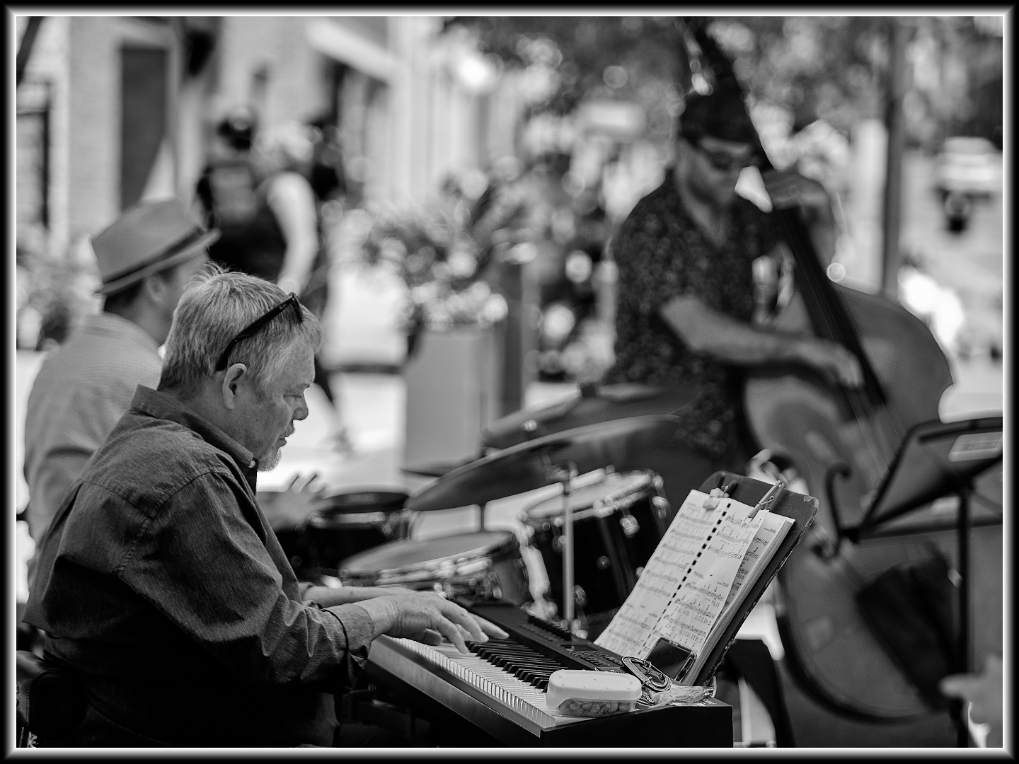
Black and white added a theatrical look to the image and eliminated the colour cast from the overhead canopy.
GaltJazz
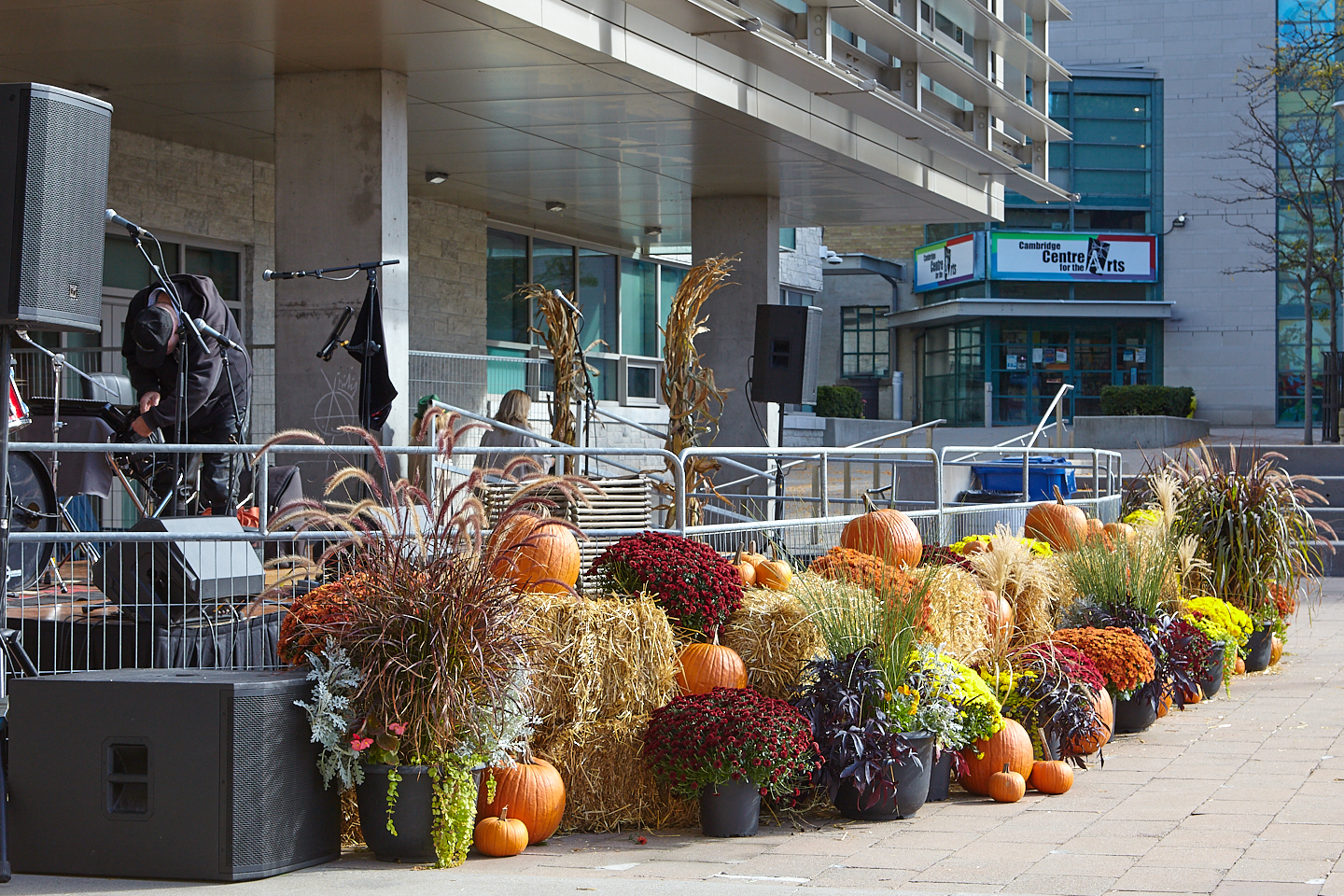
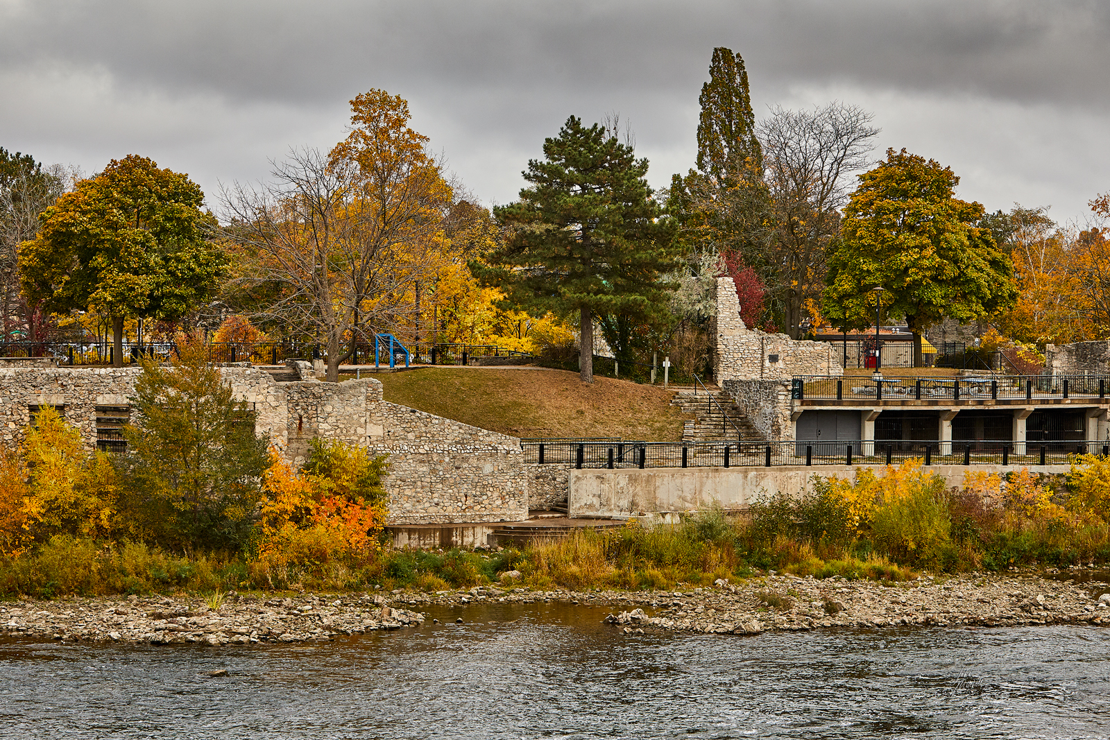
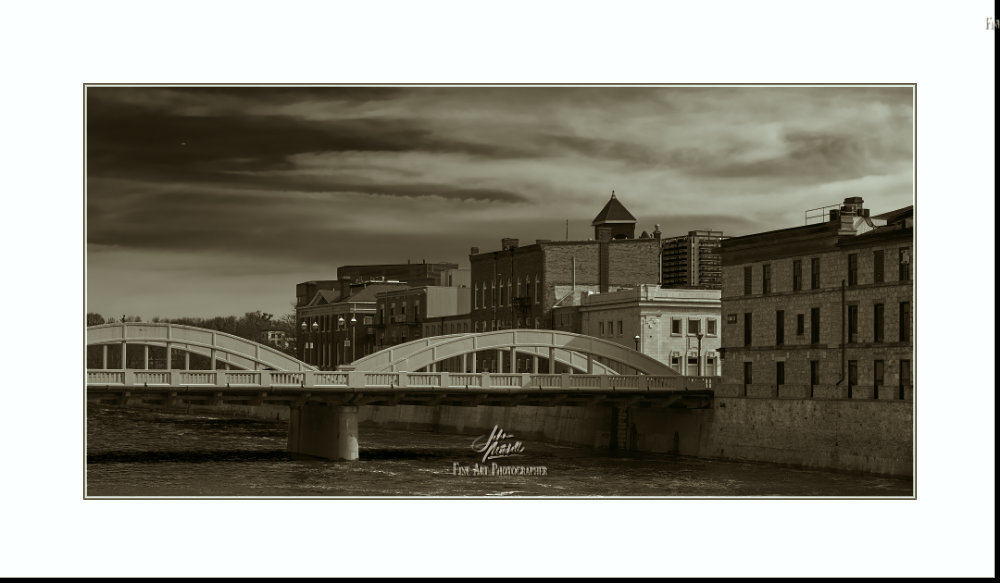
This past Sunday I ventured downtown for my first exposure of GaltJazz. This festivity of music is presented on the last Sunday of the month from May until September. The…